What Reasoning Models Reveal About Visual Reasoning Progress

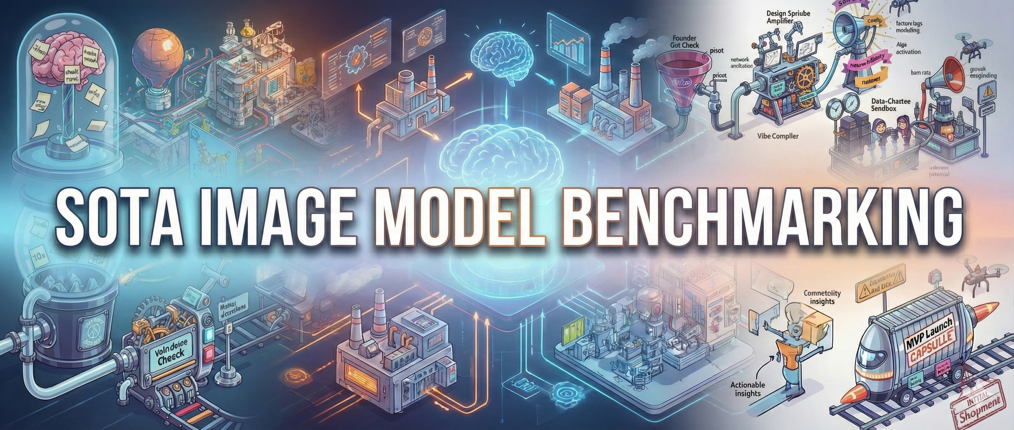
Progress around image models in November moved quickly, even for the Generative AI space.
The top slot shifted more than once, and several major releases redefined what the SOTA (State Of The Art) models/agents can do. Grok 4.1 Imagine, Nano Banana Pro, and Flux.2 stood out, not just as upgrades but as signs that image generation is absorbing the reasoning and planning capabilities we typically associate with LLMs. Models are starting to form a full understanding of a request before they generate the image, which is why we see cleaner pipelines, stronger spatial logic, and higher-resolution output (up to 4k images!).
The pace of improvement is easy to overlook. At the beginning of the year, most models struggled with basic hand structure and none could actually spell labels in the image correctly. Now they generate diagrams and scenes that are almost indistinguishable from professional work. With that shift underway, it felt like the right moment to run a structured benchmark across the top systems and see how they handle a task that mixes reasoning, layout, and stylistic control.
The Prompt
The goal was to stress the models in ways that simple descriptive prompts no longer do. The task required the system to research the concept of vibe coding, map the steps involved, and maintain that context across a longer sequence. It then had to design a visual layout that fit the full process, allocate space across the pipeline, and keep the structure coherent as the scene grew.
Once the flow was in place, the model needed to generate imagery that matched the sequence and preserve the labels it introduced, even as it refined them during styling. The final pass required applying text, color choices, and a consistent mechanical aesthetic that still reflected the intentionally exaggerated Silicon Valley theme.
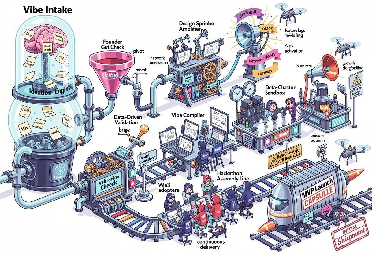
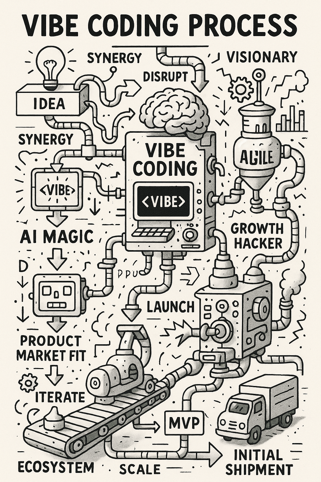
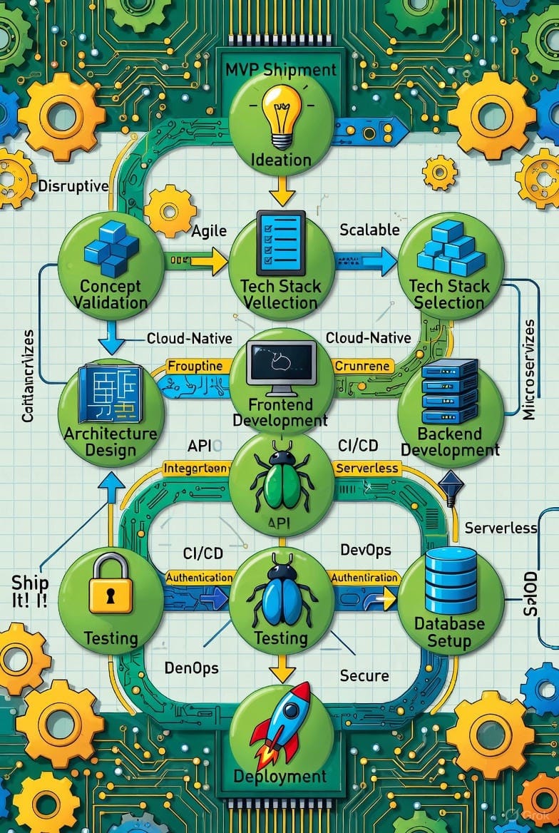
The brief asked for a 2D mechanical drawing of the vibe coding process from ideation through MVP shipment. The intent was to surface how well each system can handle a structured, multi-stage request that mixes research, reasoning, layout planning, and stylistic control.
Create a 2D mechanical style drawing of the vibe coding process. Start from ideation of the concept to be vibe coded and add in the stages all the way up through initial shipment of the MVP.
Make the process flow over the top wacky and zany. Include lots of buzzy Silicon Valley words with a strong stereotypical Silicon Valley theme
How The Models Performed
Each system revealed a distinct way of interpreting structure and metaphor.
- Flux-2
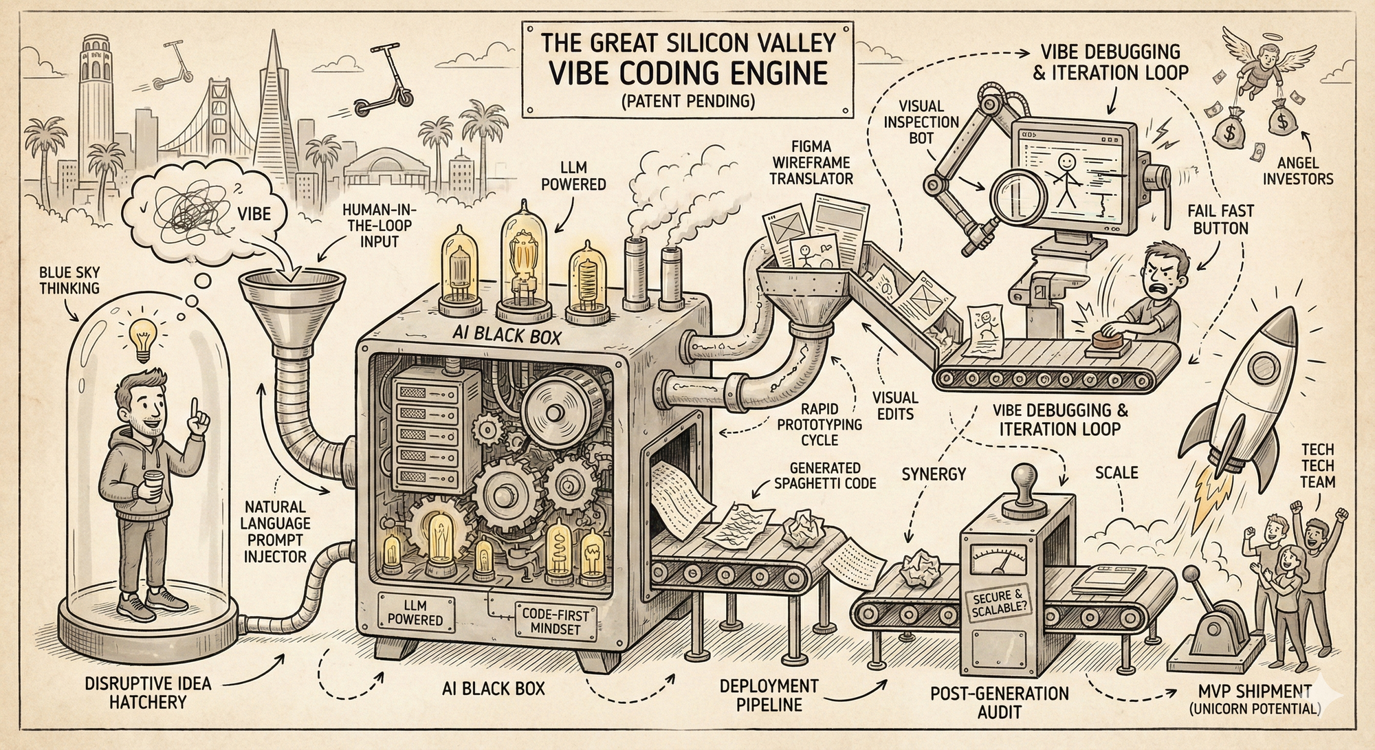
Flux-2 shows the strongest structural reasoning of the group. The whole pipeline hangs together cleanly, and the model handles dense systems without losing the thread. The visual polish is high, and the mechanical logic reads well on first pass. The weak spot is text stability. Once you look closer, spelling and label drift start to show up. Still, in terms of composition and coherence, this is one of the most capable interpretations. From a purely "vibes" standpoint, this was my favorite image generation.
- GPT-5.1
The ChatGPT 5.1 image is clean, structured, and easy to follow. It holds the pipeline together without a ton of drift, and most labels land in the right place. The tradeoff is that it plays things safe. You see clear logic, but also familiar buzzwords and repeated concepts. It’s stable and readable, but not as inventive as some of the other models.
- Kling Image 2.1
Kling delivers a polished, commercial look with strong color discipline and a clean production-studio feel. The flow is easy to follow and the visual storytelling is clearer than most models. The tradeoff is depth. The pipeline reads more like a branded illustration than a complex process flow, and several labels drift into near-words once you look closely. It’s high-quality and energetic, but more aesthetic than structural. If you were handing this over to a seasoned graphic designer for clean-up, this would be a great first draft.

- Grok 4.1 Imagine
The Grok image has a clear visual theme and strong color structure, but the logic breaks down as you move through it. You get recognizable stages, yet the text starts to drift and several labels collapse into near-words. The composition feels packed and energetic, although that energy comes at the cost of coherent flow. It’s less creative than I would've liked, most older models lean hard into the circuit board visuals whenever you mention technology, leading me to believe the reasoning is still somewhat weak with Grok when it comes to images.
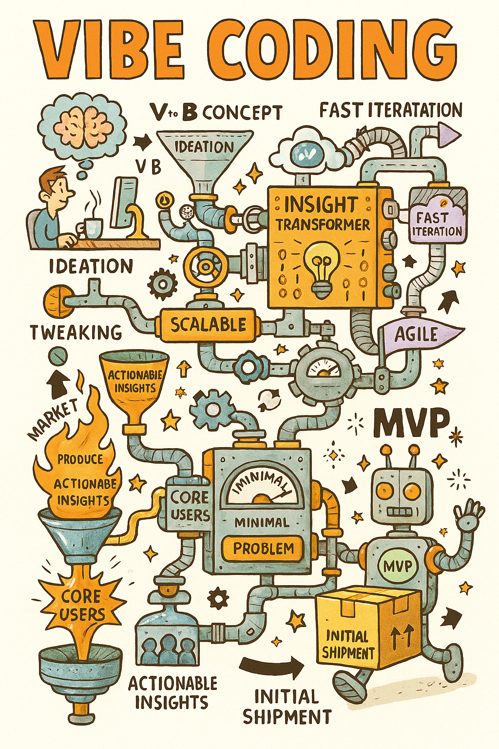
- Gemini 3 / Nano Banana Pro
Nano Banana Pro lands with a clear narrative and a consistent sketch style that holds the whole diagram together. The flow is easy to trace and the metaphors stay grounded, which gives the image a coherent rhythm. The tradeoff is that it leans heavily into illustration. There’s less structural precision in the pipeline and more emphasis on storytelling and visual charm. It works well as a concept piece, but it’s not as rigorous as the models that prioritize system logic.
- Microsoft Copilot
The Copilot image is straightforward and readable. The pipeline holds together, and most labels stay on-track, which makes the flow easy to follow. The limitation is ambition. The structure is simple, the metaphors stay literal, and the system doesn’t push into deeper visual logic. It’s clear and dependable, but it avoids the complexity the stronger models handle. Again I'm unsure of the specific underlying model the Co-Pilot app was using but I'm guessing it was GPT-5.1, which would explain the visual being so similar to the OpenAI image. What I think is interesting is with the same prompt we got a different output, this speaks to the variability in harnesses that the apps use for their models.
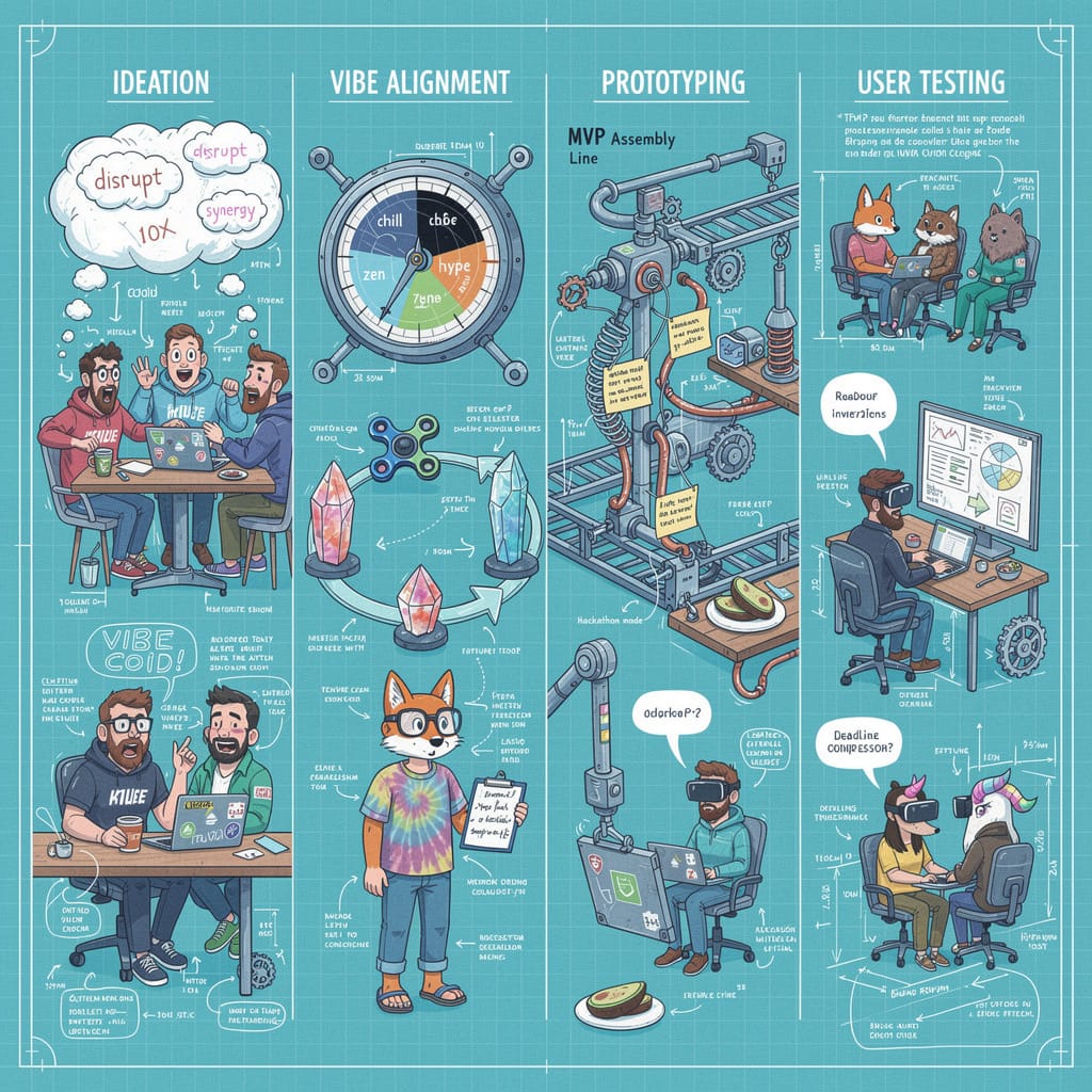
- Meta’s Emu image generator (mobile app)
The Meta image leans hard into sketch energy. It’s dense, freeform, and full of motion, but the structure collapses once you try to follow the pipeline. Text quickly drifts into illegible placeholders, and the system logic gets buried under stylistic noise. It’s visually interesting, yet not useful for understanding a process. This feels more like concept-art improvisation than a coherent diagram.
- Mistral, Black Forest Labs image model
This image is polished and well-structured, with a clear four-stage layout that makes the whole flow easy to parse. The styling is consistent and the line work's clean, which gives it a professional, illustrated-manual feel. The tradeoff is that it prioritizes character scenes and visual charm over system depth. The pipeline is coherent, but it’s lighter on technical logic than the stronger models. It’s a good-looking diagram, just not as structurally ambitious as the top performers. (actual image model is unknown, used the Misteral app to generate the image)
What Does This Mean For Current Image Models?
The biggest gap across the models is structural reliability. Flux-2 and GPT-5.1 both managed multi-stage pipelines, yet each showed a different form of drift. GPT-5.1 kept spelling and labeling stable, but the overall flow loosened once the diagram became dense. Flux-2 held the broader pipeline together with more discipline, although label accuracy degraded when the scene grew crowded. These differences show how even the stronger models still trade off between semantic clarity and structural coherence when the layout becomes long and detailed.
Grok 4.1 and Meta’s Emu generator exposed sharper failures. Both produced high-energy compositions with clear stylistic intent, but the logic weakened as complexity increased. Grok kept a recognizable sequence, although labels softened and spacing collapsed in the center of the diagram. Meta leaned harder into expressive motion, where text degraded quickly and components merged into loose clusters. In both cases, style carried the image, but the underlying sequence became difficult to trace.
Misteral’s output landed in the middle of the field. The diagram was polished and readable, and the four-stage layout created a clean structure that held together on first pass. Linework and styling were consistent, which gave the image a professional feel. The limitation was depth. The model emphasized character scenes and broad storytelling beats rather than the detailed system logic that the more structurally-oriented models attempt. It worked well as an illustrative overview, but it did not push into the same level of technical precision.
Style identity is also becoming a clearer separator. Kling produced the most commercial aesthetic, with a studio-like finish that read more like branded illustration than a technical system. Nano Banana Pro kept a coherent sketch style that preserved the metaphor and made the flow easy to follow, although structural precision dropped as density increased. Copilot remained literal and conservative. The flow stayed intact, but it avoided the more ambitious compositional decisions that the top models attempt. These patterns point to a broader shift. Fidelity is no longer the main differentiator. The useful distinction is which models can stay logically grounded while still supporting a consistent and intentional style.
Why this kind of test matters
The goal here wasn’t to declare winners. The point was to see how each model handles structured, multi-element work because that is what shows up in real workflows. Product teams need diagrams that hold together, agents need to render processes accurately, and people rely on visuals that preserve metaphor and intent.
Running the same prompt across these systems makes the differences obvious. Some models stay coherent as the scene grows, others fall back into decorative noise. The real separation isn't image fidelity but whether a model can hold a complex process together in a way that remains usable as the task gets more dense.
Note: I ran all of the image prompts
Written by JD Fetterly - Data PM @ Apple, Founder of ChatBotLabs.io, creator of GenerativeAIexplained.com, Technology Writer and AI Enthusiast.
All opinions are my own and do not reflect those of Apple or any other person or organization.